Plotting Error Bars in Google Sheets?…..on a scatter plot????
Robbyn Tuinstra, tri-athlete and AP Bio teacher extraordinaire recently had a question about putting error bars on scatter plot data in Google Sheets. Several of us weighed in—a couple of us suggested it wasn’t possible, a couple of others pointed to a video where custom error bars were placed on a bar graph. I mentioned that I had tried before to do this but gave up since I use other tools like Excel, Plotly and various stat programs. Still this issue festered for a while and I finally had to try and attack it again. I was partially successful. I’ll describe what I have discovered but this also provides an opportunity to revisit suggested quantitative goals that the community might want to work towards.
First the type of experiment/data appropriate to this question. Last year I produced a series of posts that featured a lengthy coverage of the types of data analysis and model application one might want to consider when doing a very simple lab–the yeast catalase floating disk lab. You can find these posts on the Kansas Association of Biology Teachers Bioblog: https://www.kabt.org/2017/02/06/summary-post-for-teaching-quantitative-skills/
I didn’t use google sheets in these posts but I will here. Here is a data table of results that has already been transposed from disk rise time to rate of disk rise in floats per second.
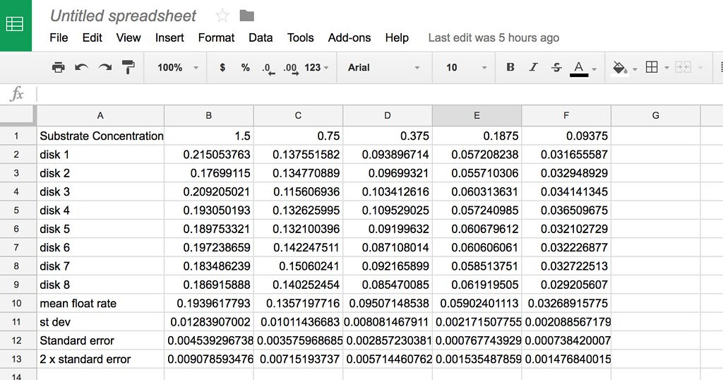
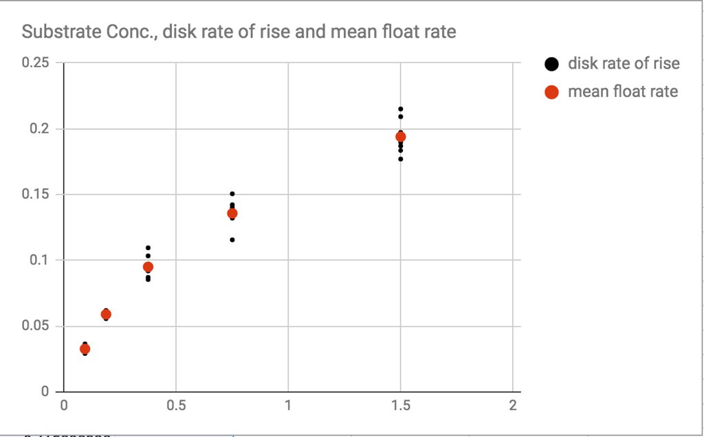
This data table is typical of how we might record this types of data. In the original postings I talked about how to plot this data and to do a curve fit. Here’s one way to plot this data (in excel) using approx. 95% error bars (2 x SEM).
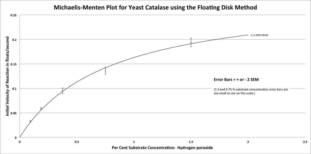
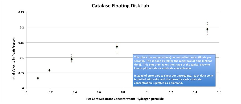
I think this is the type of data and plot that Robbyn was talking about. The model for enzyme kinetics is known as the Michaelis-Menten equation and it can be used to fit the data. I’m not sure we want to get into that in the AP Bio classroom but perhaps we do. Nevertheless, I think we definitely should consider having students at least generate the graph. The error bars are nice but I think when it comes to developing student argumentation from evidence that simply plotting all the data points along with the means is sufficient. A plot that looks like this in Excel:
How do we do this in Google Sheets?
One of the first things to do to make this easier to plot is to change the data table into something like this:
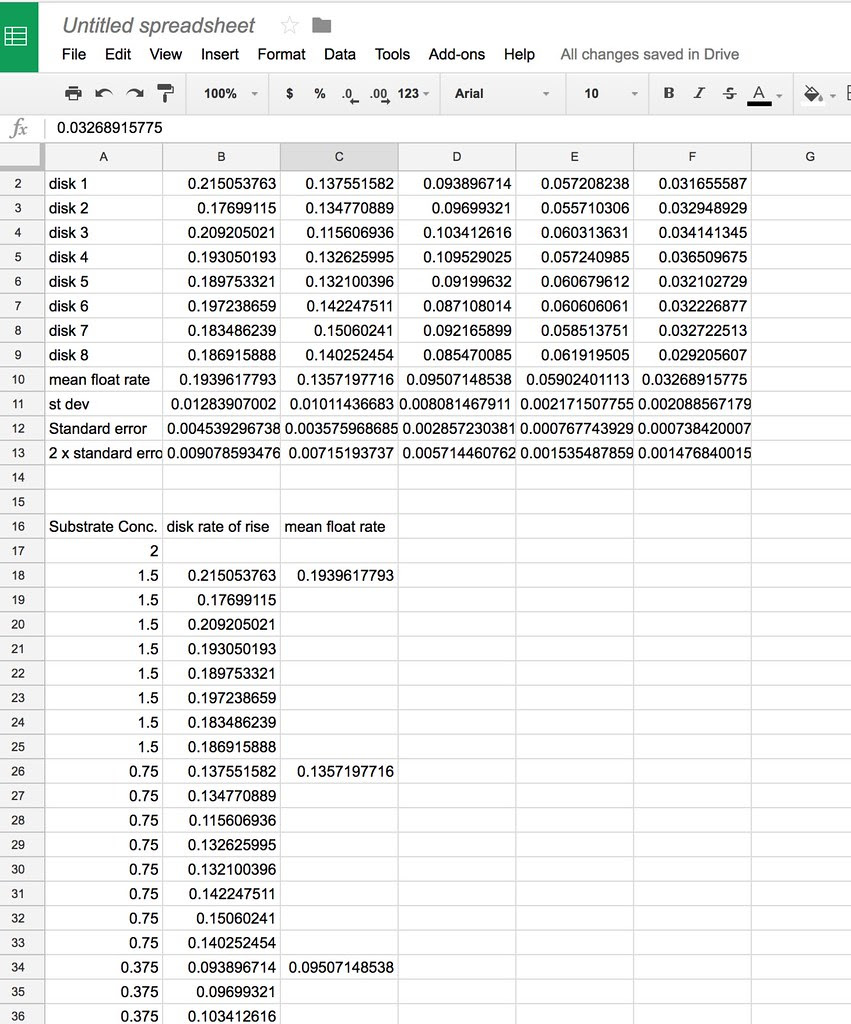
Note that there is a column for the data points and a separate column for the means. This allows us to plot two dependent variable series on the graph. We’ll use this strategy later. Note that I have also added a 2 % substrate concentration and a 0% substrate concentration but I have left the rise time blank for these. These x variables extend the range of of the x axis when we plot.
Select these columns, choose Insert Graph and change to a scatter plot you end up with a plot that looks like this:
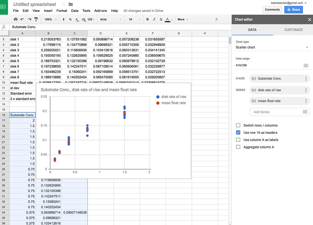
Here I’ve changed the size and color of the individual data points.
I won’t go into modifying your lablels, axis titles and titles.
Personally, I think this is more than adequate evidence to make the argument about the shape of this curve but I imagine in my classes we’d go for a non-linear curve fit (to help them justify the upper end math classes they are taking)
But perhaps, like Robbyn you want to include error bars instead of the data points for each substrate concentration. This really doesn’t seem to be possible with simple menu options in Google Sheets. (obviously, if you want to get into programming, it would be possible). I did however find this work around.
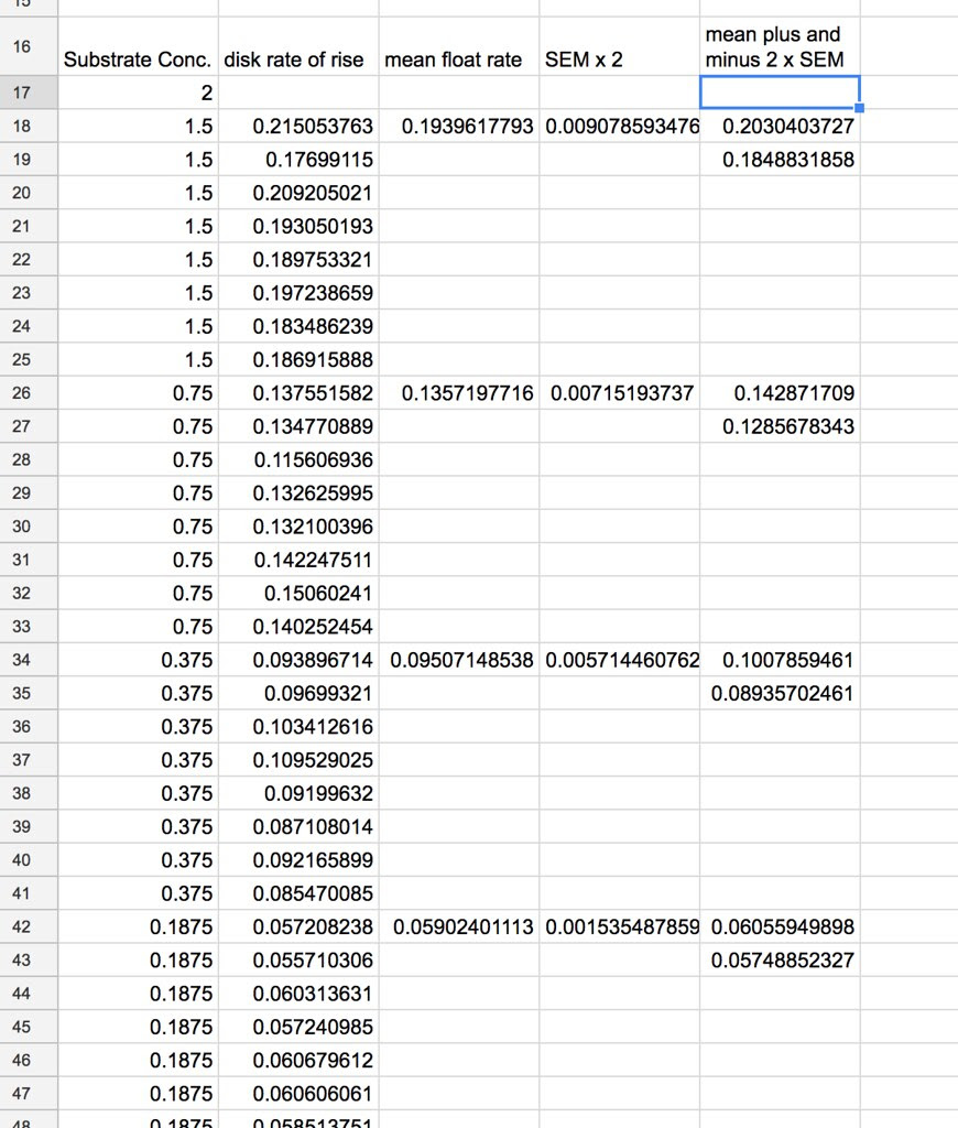
First let’s change the data table again. Lets add a new column that has a calculated 2 x standard error of the means. And another new column that includes values for [mean + (2 x SEM)] and [mean – (2 x SEM).] Now the table looks like this:
Highlight the entire table, insert a chart BUT here is the thing. If you highlight the data and let Google sheets determine the graph type it will pick Line Graph. Let it this time. That is key to what we need to draw the error bars. You get something like this:

We have too many variables plotted. We don’t need the individual data points now so we’ll get rid of those. We will also turn off the plotting of the SEM (but not the plus or minus SEM). Finally, select, use column A for labels (assuming you’ve put your substrate concentrations in column A.

Once that is done, we should be down to something that looks like this. One variable plotted is the means and along with a line that connect plus 2 x SEM to minus 2 x SEM….
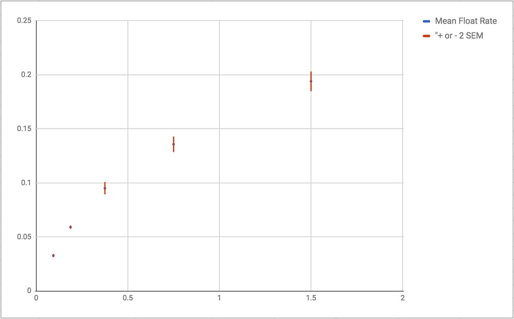
There you have it—a work around that works because by default Google sheets treats the blank cells in the plus or minus columns as null data–not zeros.
p.s.
You can turn off that feature and the graph will look like this:

Obviously not what we want.
 Next Post